How to build a modern to do
NOTE: This project is outdated. It does not implement a better way of passing multiple properties to children components such as making use of context and component composition that React offers. It also makes use of a combination of class components and function components. The standard migrates away from class components in favor of function components for readability, future support, and ease of use. This tutorial is kept for legacy purposes.
Video tutorials
Below are the accompanying videos for this tutorial. It contains both part 1 and part 2 and on average are about 1 hour and 10 minutes long.
Initialize the application
Create a new React application using the Create React App framework with Typescript and Node-Sass support. Open up terminal and issue the following commands:
npx create-react-app modern-to-do --template typescriptnpm install node-sass --save-dev
Navigate to the newly created directory and start it.
cd modern-to-donpm run start
The application will now be running and accessible at http://localhost:3000.
Component creation
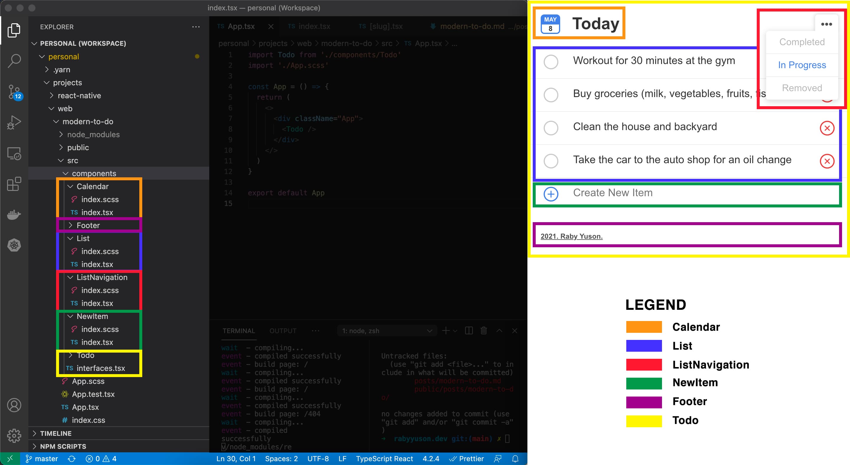
Below is a breakdown of the individual components that makes up our application. It shows both the files and visual element that makes up the component. They are broken down by function and it shows the relationship between each other.

Calendar
This component renders the current month's name (trimmed only to the first three letters), date and the string "Today". For the style, this component uses blue and white tint color and rounded borders.
List
This component keeps track of different view related data and lifts it to the parent. This renders the "NewItem" component and shows svg icons and different views. Completed - items that were marked as completed from the "In Progress" view. In Progress - items that were newly created using the "NewItem" component and items that were added back from the "Removed" view. Removed - items that were removed from the "In Progress" view
ListNavigation
This component keeps track of the selected view and lifts it up to the parent component. It shows the ellipsis svg icon and lists the different views with the selected one highlighted.
NewItem
This component accepts an input entered field and lifts it up to its parent. This component listen to the following events: keyboard, change and focus and captures most of the user interactions. It also renders an svg icon. For the styling, on hover shows or hides the hover icon. For the input field, remove the borders and use gray for the placeholder text for visual identification between states.
Footer
This component renders the footer link with dynamic text.
Todo
This parent component keeps track of all the children component's states and define event handler functions.
Interface
Shows the current month and date
App
Main component used to connect all components together
Conclusion
Once all of the components are created, the app is now complete. Refer to the completed app for the final result. Also view the project repository for the completed source code for reference.
You can view the live demo to see it in action or browse the source code to see how the project is built.


